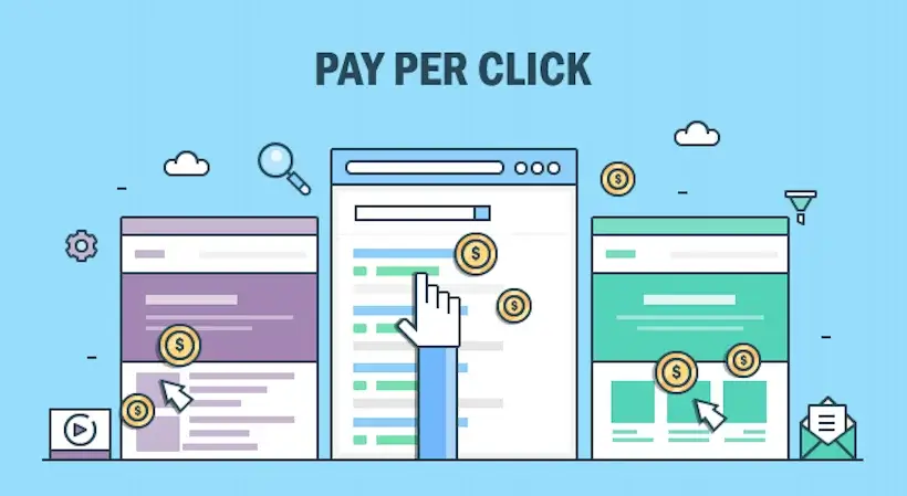
Landing pages sound easy but are difficult to maintain. This difference is due to one big reason, as different departments wants to be a part of the same landing page for their various agendas. For example: a product designer will wish to show his new product. A legal person would want all the companies’ policies right in front. Customer service department will want to show their warranty plans. You as the profit earner and the actual payer of search engine results will expect costumers who would turn buyers.
All these multiple activities on one landing page works together but do not show any positive outcome for any. To avoid such clutter and gain better results let us look at a few tips or do’s and don’ts for a landing page.
Let us Start with Dont’s
Multiple Jobs on One Landing Page
As discussed previously, we know that our ultimate motive is to convert our visitors. All we expect is a customer should look at your new products or he may register his email Id, learn your new launches and schemes, lastly the mode of contact.
This all is possible if you plan to develop multiple landing pages, this will not be a very difficult task as once you have created a design or a frame for your landing page. Making 10 more will not be a problem. It would be a better solution for readers too, to have multiple landing pages rather than having multiple jobs on one landing page.
Avoid Distractions
When your whole and sole motive is conversions then avoid adding links or buttons of other pages or website. You are basically driving your customers to other web pages and distracting them.
The links and buttons on the side bar distract your clear customers from your well-laid conversion plan.
The Do’s for Your Landing Page
Keep Your Headline, Offer and Call to Action in one Line
All the 3 components need to well placed in a line or it may cause confusion for readers and you may also loose conversions. You must follow a simple and easy and a precise. Your copy here should talk in favour of your user. What result it may give and what would a user get in return.
Extravagant Designs for Landing Page
Your landing image is the page where your users directly land. Therefore, you need to be very selective in choosing a design and selecting the correct images for the page required. As that may convince your customer for conversion.
Live Video for Product’s Working
A live video is the best way of showing your user about the working of a product. A video really persuades and is good and practical way of showing the working of a product but a video needs to be very precise and crisp.
Testimonials
Customer’s feedback whether it be video, a text testimonial, a written feedback or a trusted seal, this makes a lot of difference. You need one or two good testimonials from the users, especially if you are not very popular brand.
A separate Thank you Page
One needs to create a separate Thank you page to be polite and soft to your users. Giving more importance to responding and thanking users instead of just building a pop up box. You can also add links and diversions that was a not a very good idea to place on your landing page.
Accept New Change
Adapt and be open to new changes and editions. If your web cannot handle an entirely new page then you must make some evident changes as these may give you results that you have waited for so long.
These are one of the best tests that you can try for your landing pages. It is sure to give you some result but it is always better to experience it on your own and practically try them out.


